Usability Testing Study
Usability test scenario
Imagine you are a 28-year-old transgender woman who is working as a freelance photographer. You were recently asked to take photographs for a body-positive, plus-size swimsuit line and are looking for models for your photo shoot. Your friend told you about this app you could use to find models, and you just downloaded it.
Tasks list
1️⃣ Now that you have the app, get it ready to use.
2️⃣ Use the app to find set up a shoot. Find a model who is available on October 31, 2018, for a photo shoot at the Space Needle from 12:00 pm to 3:00 pm. You are looking for a swimsuit model with larger body size.
3️⃣ Now that you've found a model, introduce yourself and ask if they'd like to work with you.
Preparation for usability test
Before our usability test, Simone refined the prototype based on version 1 created last week. She combined the three design styles of each member and created version 2 with the feedback we got from the class. I went through it and found two points that needed to be fixed. After talking with Simone, we got version 3 for our usability test. Click me to view our team's prototype
Recruiting process
On the day our team conducted the usability test, Valerie set up the camera for taking an interview video. Simone and I printed out the intro script, the scenario, and the task sheet, and loaded the team prototype on the test phone. Then we went through our classrooms, talked with people who are available about our mobile app program, and tried to find some people who are interested in testing our early-stage mobile app. Also if they were not worried about sitting in front of a camera. In this way, we recruited six users. Thanks to all the participants who helped us to make a better experience!
Usability test sessions
1st – Martin (M, 25+) 👉 Ran: Danni, Notes: Simone, Valerie
2nd – Dylan (M, 25+) 👉 Ran: Danni, Notes: Simone, Valerie
3rd – Sara (F, 30+) 👉 Ran: Valerie, Notes: Simone, Danni
4th – Christine (F, 20+) 👉 Ran: Valerie, Notes: Simone, Danni
5th – Cameron (F, 20+) 👉 Ran: Simone, Notes: Valerie, Danni
6th – Michael (M, 30+) 👉 Ran: Simone, Notes: Valerie, Danni
Usability test analysis
Task 1
🤔 For the welcome page, one of our users said "Sweet!" the moment she saw the purple color. Most of the male users said that the page on which the Photographer button is purple and the Model button is white showed them that the app is for photographers not focused on models.
✅ Keep the purple color. When entering the welcome page, there are two white buttons which say, photographer and model. After you click the button, it will change to purple.
✏️ Then users go into the Gender page to set up their gender. For the Photo/Bio page, one of the users said he prefers not to upload his selfie at this point, and he found the skip button on the right corner. Then he clicked the skip button to enter the Create Account page.
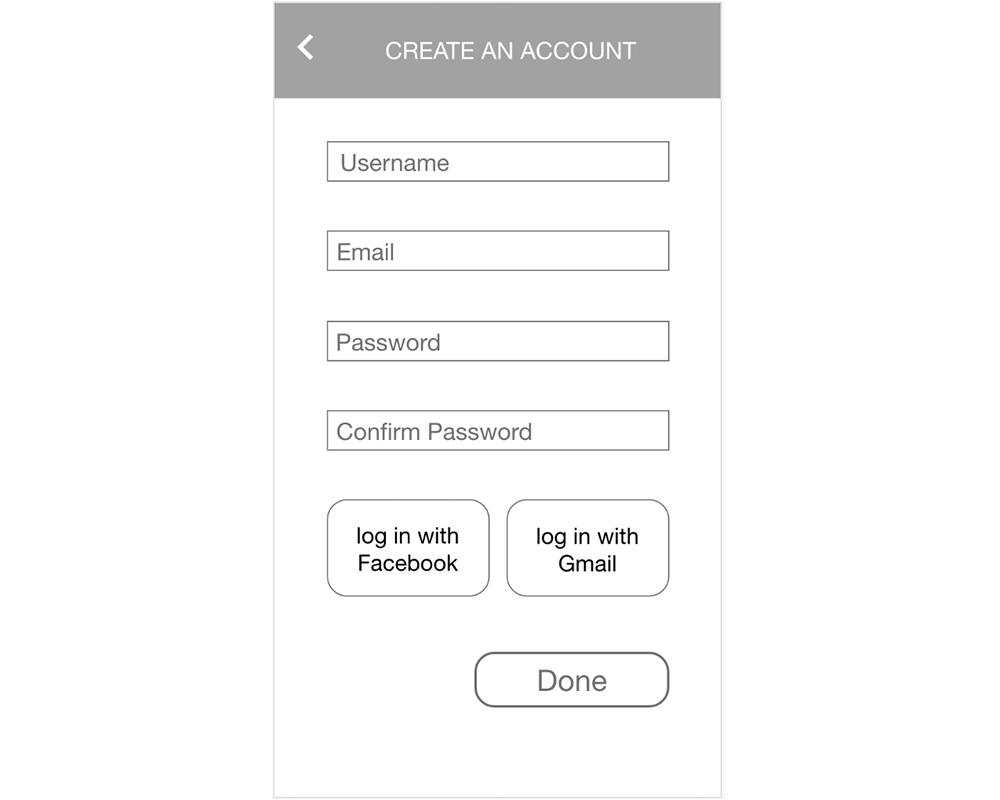
🤔 On this page, after setting the username, email, password, and confirm the password part, most of the users don't want to log in with Facebook or Gmail. One of the users said "No Facebook & Gmail!" Then he clicked the Done button.
✅ A simplified create an account page without logging in with FB or Gmail may be a better option.
Task 2
🤔 After getting the app ready to start, users enter the set up a shot page. Two of our users said they wanted to drop down options for the Space Needle because they needed a more specific meeting place (in our case, the Space Needle) than just Seattle, WA. They didn't want to end up getting lost.
✅ As our app is for local photographers, it might be useful to narrow down the area options and included some landmarks in the city for more accuracy.
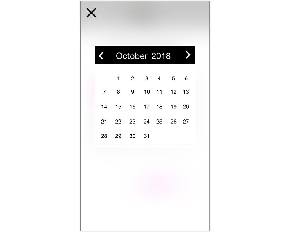
🤔 When users tried to set the date, they clicked the date on task 2, then click the x button to go back. Almost every user said, "Have I saved the date?"
✅ There should be a Done button on the page after they choose the date.
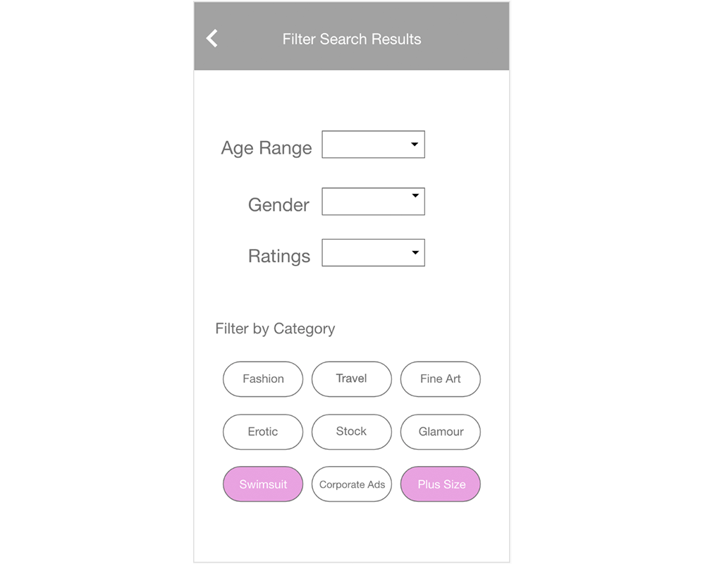
🤔 After setting up the location, date, and time, users entered the search results page by clicking the search button. Many users couldn't find a way to narrow down their need, which is looking for a swimsuit model with larger body size.
✅ Make the filter button larger and easier to find.
🤔 For the filter page, a similar problem occurred as the Date setting page. After filtering the category, users weren't sure whether their settings were saved by clicking the back button.
✅ Add a Submit button on the bottom of the filter page.
Task 3
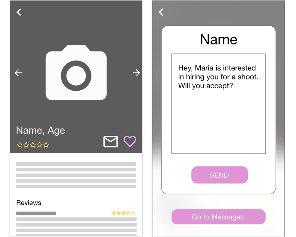
🤔 Now that users have found a model they need, they then went to the Model profile page. They clicked the email button naturally when they want to contact this model. Then a pop-up window appeared for them to write an introduction. After clicking the send button, the page showed "Message Sent!" Some users clicked the Send button with hesitation. They were confused about what will happen after they click the send button — will they go into the message page or a different page? If they will go into the message page, what's the Go to messages button for?
✅ Use a Contact button instead of the "Go to Messages" button.
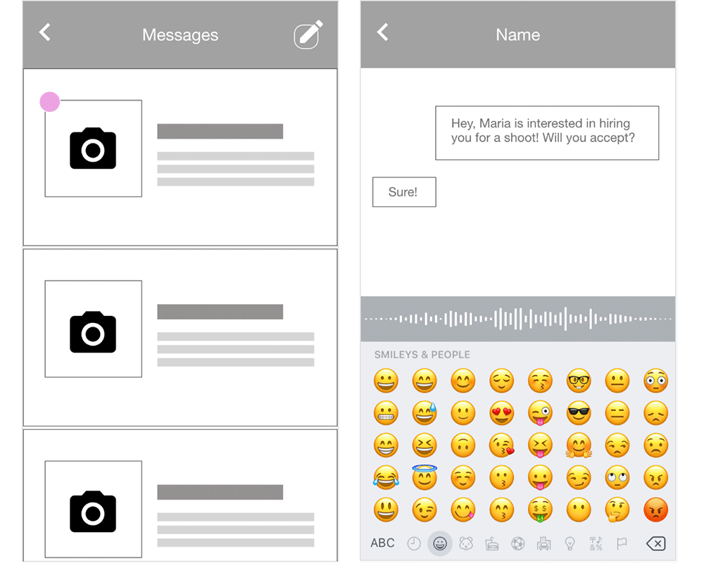
✏️ After clicking the Go to messages button, users will enter the message page. If there is a new message, a notification badge will appear on the top left of the conversation. When they click the badge, they enter the conversation page. There, they see a reply from the model saying "Sure!" One user said he liked the voice input button.
Conclusion
One apparent problem with our app is "Submit" or "Done" buttons need to be added on some pages (e.g., the Filter page and the Date page) to confirm that the task has been completed. On the Send-a-Message page, the button styles and labels need to be simplified so that the task flow is clear for the users.


