The Lesson Of Grid Systems
Most of the time I see constraint as a negative thing, especially when it comes to creativity. However, life taught me things are not simple. I believe that I am not the only person who has the experience of sitting in front of a blank paper and imagining how amazing stuff was going to be created. And sooner I got stuck, realizing that I had no idea of where to start, and feeling directionless. My work ended up with the same blank paper after three hours. I have learned that constraints are essential rules for creating a cohesive whole, and it does encourage creativity.
Grid systems provide valuable constraints for typographic layout. It helps organize complex data into easily digestible chunks of information and guides the eye between elements. As the leading practitioner and theorist of the International Style, Josef Müller-Brockmann fostered the use of grid-based designs through his book Grid Systems in Graphic Design. He condensed design elements to focus on a core message with a clean and clear visual aesthetic and stood for objective, radically minimalist geometric design. Here are some posters from the International Typographic Style. I love these posters because they focused on both clear design and giving information. The color is simple and straightforward and easy to catch your eye for all ages. The dramatic contrast between headline and body copy and the negative space makes it more intriguing.
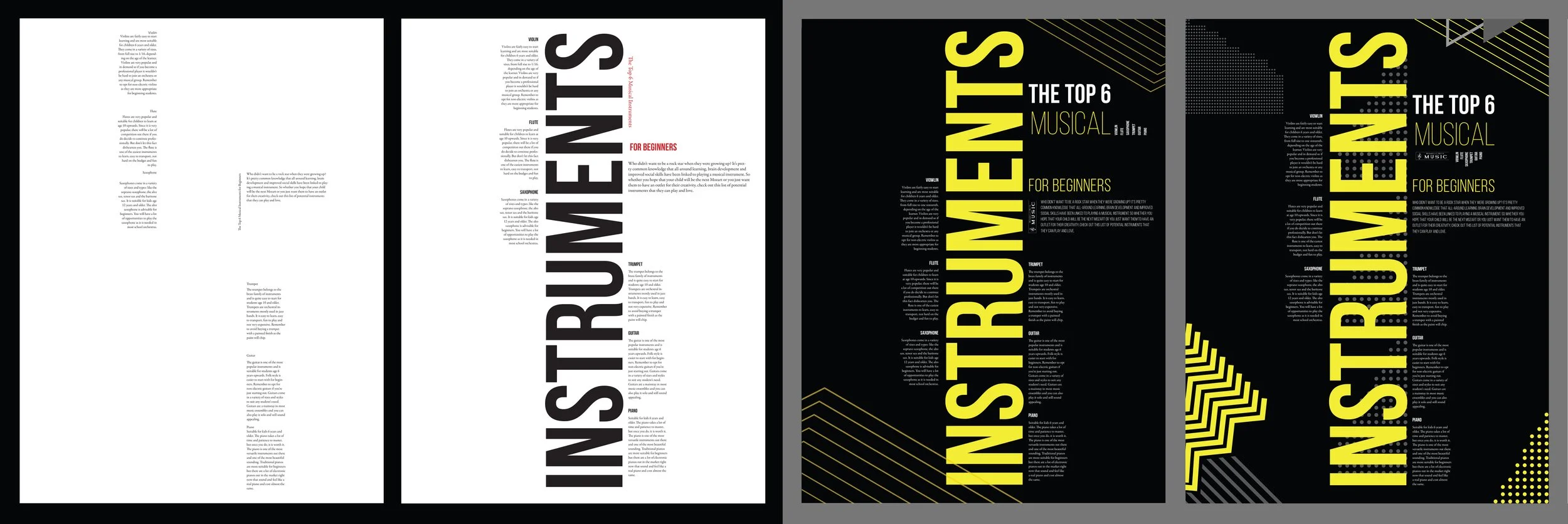
Inspired by the simplicity and clarity, I experimented with a multi-column grid in order to design a 15" x 20" instruments poster. Here are 5 design iterations.
I chose the last sketch to develop the poster design. I created lines, dots, and triangle patterns to convey the feeling of the music.
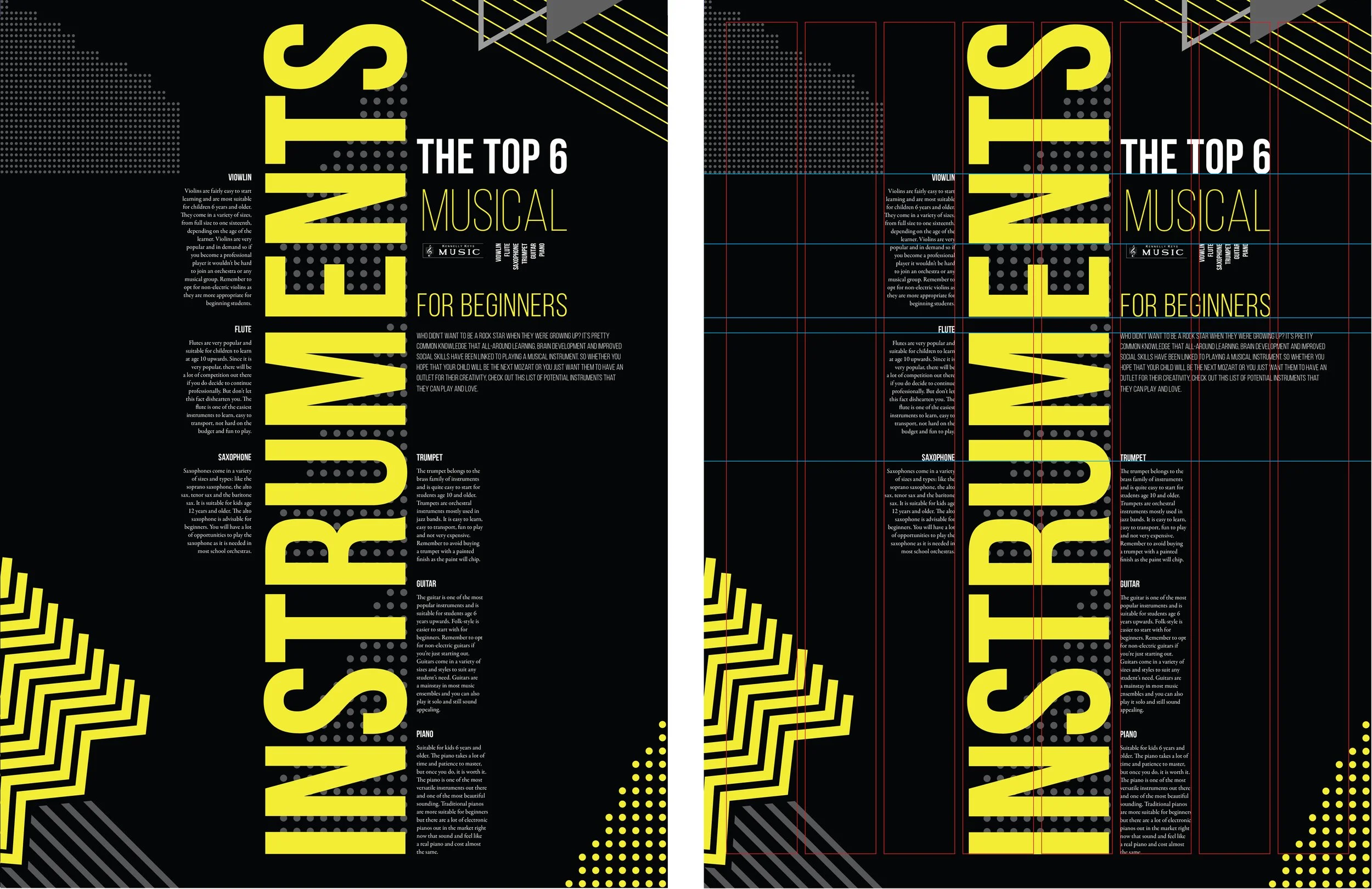
Here is my final design with the underlying grid structure visible.


